Wednesday, January 30, 2008
Good and Bad Readability
I think many would agree that a good example of a sight with bad readability would be www.myspace.com or songlyrics.com. A page with good readbility i would say is www.planetsave.com.
Tuesday, January 29, 2008
I know exactly how you feel...

Just wanted to express how I was feeling on Monday...I'm sure some of you may have had similar feelings
lol
Persian Typography

As I was looking up different typography images and web sites, I came across Iranian typography. I found it very fascintating because although I was born here, both my parent were born in Iran. It was interesing for me to see how unique and beautiful farsi type can be. I never knew there were so many varitaions of type over there as there are here. You guys should check some out at http://www.pingmag.jp/2006/12/11/iranian-typography-now/. It gives a nice little explanation of how they use type as well. Let me know what you think
Wednesday, January 23, 2008
?????
I don't understand. I know that italic is the correct way to draw attention to specific words, but if oblique is so bad and we're not supposed to use it. Why does it exist anyway????
Tramp Typography (groovy baby!)
Hey guys! Cheack out this you tube video i came across. It's an ineresting way to make learning type fun! Pay close attention to the leading and the different type faces. There's also a great use of font sizes. Hope you like it!
Tuesday, January 15, 2008
Oh it's Good!
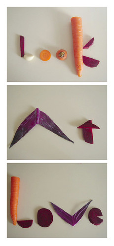
This is an example of good typography. There is a great use of space between letters and the letting makes each word easy to read. I like the creativity. The way the typographer used vegetables to create this phrase. The reason this use of typoraphy is so successful is because the placement of words is organically sound, which as a result is more appealing and legible to the reader. It also successsfully illustrates the artists love for vegetables. It gets the point accross!
Oh so Bad...
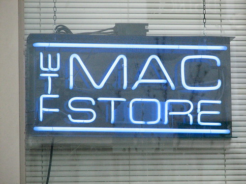
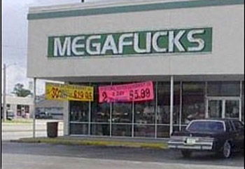
While searching for some examples of bad typography, i came across this link that describes what bad typography really means. Go to... www.john@badtypography.com and click bad typography. It's a nice little overview. Also i have included an example of bad typography. The image was intended to read as "The" Mac Store but since the letters are so close together instead of reading as such to the side it looks like "WTF" straight up and down. Lol....I doubt anyone wants to go to "WTF" Mac Store. Poor usage of typography indeed. I almost feel sorry for whoever came up with the idea. Also included a bonus of bad typograhy. Lol. The use of typography in this image has a similar problem as the previous one.
Sunday, January 13, 2008
ligatures
I still don't understand the real purpose of ligatures. I mean...are they really necessary???
Wednesday, January 9, 2008
favorite font
So i have decided that old typwriter is one of my favorite fonts. It's probably pretty typical but i like the edgyiness of it. What do you like or don't you like about it???? Go to http://www.dablog.com and click on typwriter at the top and it's the 1st one, then let me know what you think.
Subscribe to:
Comments (Atom)