Monday, April 14, 2008
It's been a while
I figured I would blog since i haven't in a while. So I've decided the final project is my least favorite and I am willing to pay anyone 20 bucks to do it for me. Let me know:0)...Lol...calm down Greg?*!!@&%g...I'm only kidding. I did find it interesting that Bodoni is used for the Adidas logo which happens to be on of my favorite sport brands.
Tuesday, April 1, 2008
Alpha Beta Song
I just wanted to say I love the fact that Isaac wrote a song for his presentation. I felt inspired so I decided to see if I could find anyone youtube who did something similar and this is what I found. Just Click on the question mark and the link will show up.
Wednesday, March 19, 2008
Logos
I must say I was pleased with our classes logos. My favorite was larrissa's logo with the little star beside it. I think that it worked for her as a word mark as well. I also liked Justin's one with the scribbles in the background. It seemed like something he would create. It was unique and was made appealing to the viewers eye. Good use of scribbles:0)
Tuesday, February 26, 2008
Rain Skulls

I must say that I learned a lot from this last class asignment, for instance, men are whores...lol...jk...As I was trying to figure out what to write for tonight's blog I thought about how Alissa mentioned a death cab for cutie design that resembled one of our other class members. The Death Cab image used a similar blue color and idea with the umbrella and falling rain drops, but instead uses skulls. I must say though I prefer the design presented in class. It was much more clean, balanced, and readable. The Death Cab design idea is ok, I like the use of the skulls but I think it would be more successful without the puddle below it. It takes away from the type making it less readable. The band's name is supposed to be the most imporant thing on the page but it doesn't stand out enough to me. The image posted is hard to see but if you google Death Cab- Rain Skulls click on any of the band t-shirt sites and you may have a better glance. Check it out.
Wednesday, February 13, 2008
Sagmeister
While going through the different artistic ways to use type. I came across the Art Grandeur Nature 2004 on the Sagmeister Web site, which i believe we saw in the Helvetica video. I normally don't enjoy this clean illustration of type but I like the way they incorporated type within nature. I think that it is a great idea for someone to get a point across. All the words are very readable. The kerning, font size, and type are all good choices. The words have a lot of clarity which make them stand out from the space around them, their environment.
Tuesday, February 5, 2008
Here's another
So i found another site that shows a successful way to use drop caps and what they are used for. I tend to like drop caps when you use an old style font because it makes the type look more appealing. I also like when they are used in titles. But anyways, check this out. The link is...http://images.google.com/imgres?imgurl=http://www.howtogeek.com/wp-content/uploads/2007/06/5_thumb.png&imgrefurl=http://www.howtogeek.com/howto/microsoft-office/add-emphasis-to-paragraphs-with-drop-caps-in-word-2007/&h=275&w=629&sz=25&hl=en&start=12&tbnid=SwttgL_M571_-M:&tbnh=60&tbnw=137&prev=/images%3Fq%3Ddrop%2Bcaps%26gbv%3D2%26hl%3Den%26sa%3DG
Drop Caps
Hey Guys! I found this short article on good and bad drop caps. Check it out
http://images.google.com/imgres?imgurl=http://www.daddydesktop.com/Images2/B%26A%2520dropcaps1.gif&imgrefurl=http://www.daddydesktop.com/BAdropcaps1.html&h=741&w=604&sz=24&hl=en&start=4&tbnid=BcRwdthVBxur_M:&tbnh=141&tbnw=115&prev=/images%3Fq%3Ddrop%2Bcaps%26gbv%3D2%26hl%3Den%26sa%3DG
http://images.google.com/imgres?imgurl=http://www.daddydesktop.com/Images2/B%26A%2520dropcaps1.gif&imgrefurl=http://www.daddydesktop.com/BAdropcaps1.html&h=741&w=604&sz=24&hl=en&start=4&tbnid=BcRwdthVBxur_M:&tbnh=141&tbnw=115&prev=/images%3Fq%3Ddrop%2Bcaps%26gbv%3D2%26hl%3Den%26sa%3DG
Wednesday, January 30, 2008
Good and Bad Readability
I think many would agree that a good example of a sight with bad readability would be www.myspace.com or songlyrics.com. A page with good readbility i would say is www.planetsave.com.
Tuesday, January 29, 2008
I know exactly how you feel...

Just wanted to express how I was feeling on Monday...I'm sure some of you may have had similar feelings
lol
Persian Typography

As I was looking up different typography images and web sites, I came across Iranian typography. I found it very fascintating because although I was born here, both my parent were born in Iran. It was interesing for me to see how unique and beautiful farsi type can be. I never knew there were so many varitaions of type over there as there are here. You guys should check some out at http://www.pingmag.jp/2006/12/11/iranian-typography-now/. It gives a nice little explanation of how they use type as well. Let me know what you think
Wednesday, January 23, 2008
?????
I don't understand. I know that italic is the correct way to draw attention to specific words, but if oblique is so bad and we're not supposed to use it. Why does it exist anyway????
Tramp Typography (groovy baby!)
Hey guys! Cheack out this you tube video i came across. It's an ineresting way to make learning type fun! Pay close attention to the leading and the different type faces. There's also a great use of font sizes. Hope you like it!
Tuesday, January 15, 2008
Oh it's Good!
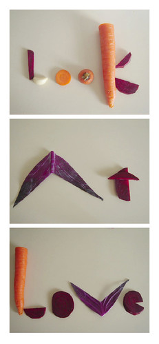
This is an example of good typography. There is a great use of space between letters and the letting makes each word easy to read. I like the creativity. The way the typographer used vegetables to create this phrase. The reason this use of typoraphy is so successful is because the placement of words is organically sound, which as a result is more appealing and legible to the reader. It also successsfully illustrates the artists love for vegetables. It gets the point accross!
Oh so Bad...
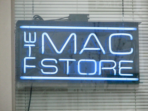
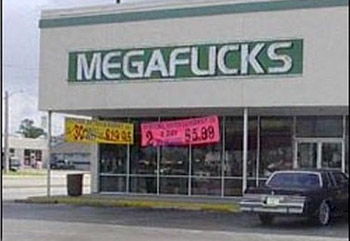
While searching for some examples of bad typography, i came across this link that describes what bad typography really means. Go to... www.john@badtypography.com and click bad typography. It's a nice little overview. Also i have included an example of bad typography. The image was intended to read as "The" Mac Store but since the letters are so close together instead of reading as such to the side it looks like "WTF" straight up and down. Lol....I doubt anyone wants to go to "WTF" Mac Store. Poor usage of typography indeed. I almost feel sorry for whoever came up with the idea. Also included a bonus of bad typograhy. Lol. The use of typography in this image has a similar problem as the previous one.
Sunday, January 13, 2008
ligatures
I still don't understand the real purpose of ligatures. I mean...are they really necessary???
Wednesday, January 9, 2008
favorite font
So i have decided that old typwriter is one of my favorite fonts. It's probably pretty typical but i like the edgyiness of it. What do you like or don't you like about it???? Go to http://www.dablog.com and click on typwriter at the top and it's the 1st one, then let me know what you think.
Subscribe to:
Comments (Atom)